Last time, I showed off the comparison between the first cover I commissioned for Against the Eldest Flame, and the final cover I published. Today I’m going to talk about how the final cover came to be.
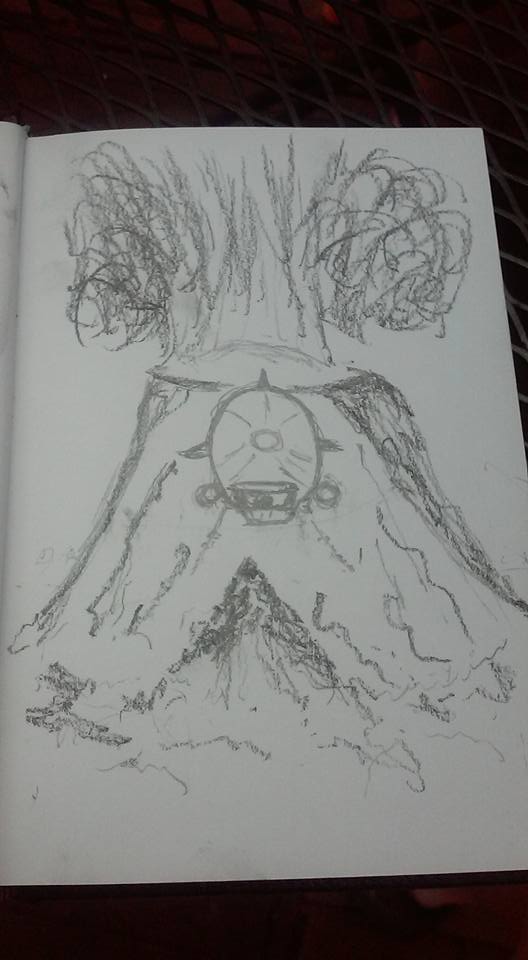
At the top of the page, you’ll see my original sketch that became the cover for Against the Eldest Flame, and really set the stage for my vision of the series’ visual identity. It’s not the same as the final cover by any means, but all the elements are there. Unlike the previous airship cover, this one really was my idea from the start.
The biggest design change was moving the Zeppelin above the volcano instead of right in front of it. That worked, but it was a matter of detail more than anything else.
On the whole though, I was happy with my original design. First, it had action; something was happening in the picture. Second, and more importantly for the overall vision, it was reminiscent of pulp magazine covers. They were paintings, they weren’t photorealistic. Artists like Alex Schomburg, Margaret Brundage, and H.W. Wesso had a very distinctive look, one that was completely different from modern self-published paperbacks.
Of course, it doesn’t help that many premade covers are assembled from photographic elements and the shadows don’t always match. It may be a personal thing, but I find it looks terrible.
As a creator, though, this cover was hugely important to me. While it’s not my art you see on the page, it is my design. As a self-published author, this matters a lot. By creating the original design I made sure that the cover reflected my vision, not someone else’s.
Take control of your vision: it’s worth it.


