About that Cover…

Last time, I showed off the comparison between the first cover I commissioned for Against the Eldest Flame, and the final cover I published. Today I’m going to talk about how the final cover came to be.

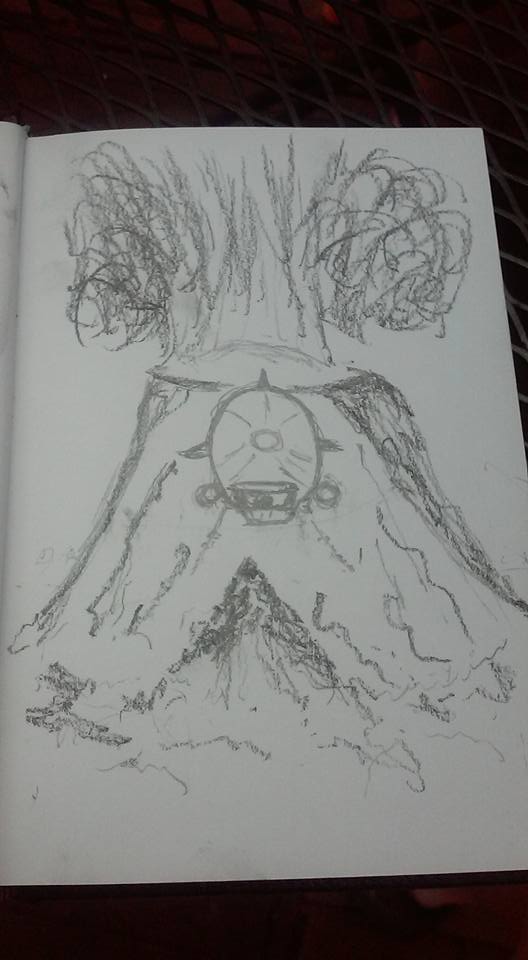
At the top of the page, you’ll see my original sketch that became the cover for Against the Eldest Flame, and really set the stage for my vision of the series’ visual identity. It’s not the same as the final cover by any means, but all the elements are there. Unlike the previous airship cover, this one really was my idea from the start.

The biggest design change was moving the Zeppelin above the volcano instead of right in front of it. That worked, but it was a matter of detail more than anything else.

On the whole though, I was happy with my original design. First, it had action; something was happening in the picture. Second, and more importantly for the overall vision, it was reminiscent of pulp magazine covers. They were paintings, they weren’t photorealistic. Artists like Alex Schomburg, Margaret Brundage, and H.W. Wesso had a very distinctive look, one that was completely different from modern self-published paperbacks.

Of course, it doesn’t help that many premade covers are assembled from photographic elements and the shadows don’t always match. It may be a personal thing, but I find it looks terrible.

As a creator, though, this cover was hugely important to me. While it’s not my art you see on the page, it is my design. As a self-published author, this matters a lot. By creating the original design I made sure that the cover reflected my vision, not someone else’s.

Take control of your vision: it’s worth it.

That Vision Thing

Or Why I didn’t Choose the Cover on the Left

Like all self-published authors, I went through multiple options before finally choosing my cover art. I thought about the public domain, and even tried a couple of public domain images on my first two novels.

When it came to Doc Vandal, that didn’t work. I wanted something better than I could get by slapping some new text over an old painting. You can see my first attempt to commission a cover for Against the Eldest Flame on the top left.

If you look at it, there’s absolutely nothing wrong with it as an image. A photorealistic Zeppelin is coming out of the clouds; title and author are right there and it’s even identified as a Doc Vandal adventure. It’s also static and boring. It’s a generic cover and basically just sits there.

Perhaps more importantly, nothing about it says “Pulp Adventure!”

Now look at the second cover, the one on the right. What can only be described as a main battle Zeppelin is flying out from an exploding volcano. It has action, it has bright primary colors. Most importantly, it’s done in a retro art style that calls back to the pulps.

There’s nothing photorealistic about it, and that’s deliberate.

I have a vision for my Doc Vandal adventures. You can see it in the covers, and it goes beyond the art style. There’s a consistent trade dress, with a logo and the volume number on every cover. You don’t have to be able to read the words to know a Doc Vandal cover when you see one.

There’s a consistent vision here, and that’s important. It shows potential readers that I know what I’m trying to do; that I have a goal in mind. It’s not enough to make sure your books are where readers can see them; you have to make sure they can recognize them.

You need a vision, and even more importantly you need to articulate that vision.